Thursday, February 22, 2007

flipbook, take 2

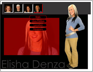
this is the newer main page. on the right in the formally blank black space are now category names for each face chunk, instead of the "please explore" and directions for opening the boxes. one of the group members said having directions for the audience is too obvious, so those were dropped.by clicking on the folded edge tab, you switch face parts to someone else (but only for that row.) by clicking the main photo area, you open the content page specific for that catagory, to view photos larger or read the personal information.


if you notice now, the box is aligned right as it slides in from that direction when a category photo is clicked. the space is wider to show more of the photos, and the box edge is now not a blinding white, but a softer gray. instead of the category name and what the photo is of, there is now a brief sentence describing what the photo is/how it relates to the category.

another new thing is the transparent black box under the information layer- it's now a lot more transparent so you can still see a lot of the background flipbook. adream mentioned adding a soft dropshadow under the top layer so it looks offset a little more- it's subtle, but it is indeed there to add some more of the dimensionality.


finally, the personal information page has gone through its own slight changes. mainly, categorizing
the information so that it lines up into the 1/3 proportion found throughout the layouts. also noted is getting rid of the white box with the red x in it- this was too obvious and not integrated enough, so now it's the same soft gray color as the text and box edges, and instead of an 'X', it's a carrot to symbolize sliding the box back to the right to close it.


now some questions/suggestions from the other groups...

-should the transparent box between the main layer and the subpages be colored instead of a transparent black? as in, information would be a neutral blue, loves could be soft red and hate could be a dark green? all of them would be transparent as the middle layer is now, just not black.

-should there be a directions page or an area that explains the two different things meant to happen in the interactivity?

-any suggestions on the category names on the main page?


thanks for looking and commenting!

Wednesday, February 21, 2007

Front page interface


Here's what I came up with for the first page navigation. Each point of the map would light up in a different color on rollover, and when clicked it takes you to the content.

Group 2 (Rob)

This would appear after clicking the Fear option:

And these slide out when clicked:

primary nav (David)

The initial view:
What happens when a spoke is rolled over:

julie +stef redesign - secondary page

Mine above and stef's below

Group 1 layouts (Kristen)


Friday, February 16, 2007

Robin's interfaces

So sorry about the late post!

The first one is based on a museum. Everyone would have one room. You navigate from room to room using the small map in the corner. In each room would be a "statue" of the person and the pictures that define us would be hanging on the wall. (Sorry I didn't have a photo, so I used my sister for the example.) Clicking each picture would bring up a description on the right.

The second one is a spiderweb. The person's picture goes in the center, and clicking each of the dew drops would bring up the information or pictures on the left. I was thinking maybe each person could have their own web and you could click the longer strands to jump over to the next web.

Thursday, February 15, 2007

Structural Thinking by Dustin

Ok, I've got a couple more here. This idea has a little ways to go in terms of looks, but it could really fit any concept. First, start off with the three main categories, Love Fear Hate. Click on one and that icon goes to the corner and a strip of images comes up. All the images are representations of every classmates' fear. rollover the images to move and reveal the name of the student. Click on the image and an information window will appear. This information will include all of the default questions we were asked to answer, only being specific to whichever category you are in. The fear category is pictured, so all of the info would be based on fear. instead of favorite movie or book, it would be a movie or book that scares you are something like that. Also included would be anyother images that represent the student's fears. To get back to the main screen just click the icon in the top left. This way even though you can navigate to the same student three different ways, the information that will come up will be different. Ok, just let me know what you think, I talk to much. ha, right.

Dustin


Ok, this is my first concept. A little bulliten board theme with the main navigation being Love, Hate, and Fear. Its really more the structure that I like than the look. I think since the focus of this project is what we love, hate, and fear, then that is how I would like to categorize the information. First by love, fear, or hate, then by student. Not the other way around. The next layout that I have done is more of a structural map of how I would like to lay out the interface.

Julie B Interface Designs


This first design is based off of a Museum map that gives each student a room in which their life & personality can be exhibited for the viewer's discovery & education. The rooms would most likely have colored borders that appear when rolled over and onClick would make the room open up to be viewed.


This design is a kind of sneaky detective approach to discovery. The tools on the side of the screen can be dragged to a file and used to open it up and zoom to different items. The file would have paperwork, including the student's name, age, etc & pictures.

ceci nes pas un interface. [AMALIA]

1. this one is based on those children's flip books where there are three portions and you can build all sorts of crazy faces. ideally, the face pieces would all be illustrated to limit the creepiness. currently they are demonstrated as photos, but just imagine cutesy boys in beards, illustrator style in their place.


this could be a potential book turned to. goofy awesomeness! this is why illustrations are preferable.


hovering switches between face pages. clicking ends up opening more photos in the category or the person's info (top level is info+bedroom/shoes, middle is love and defined by, bottom is hate and fear)


2. this one is based on a word scrambler. the letters are blurry in the image to symbolize letter movement- all letters are constantly moving besides everyone in the classroom's name, which are colored slightly and stationary.


upon clicking a name, two image browsers can pop up and show photos to click through. the letters would fade slightly but continue their dizzying movement.

Trevor Farella Ideas


Hey every body, I just got my power back, sorry about the late post.
Thanks for your comments. - Trevor

Wednesday, February 14, 2007

Some layouts


here's a two dimensional interface where you can select each individual person and cycle through their jazz or you can choose your jazz and cycle through the people. kinda like a slideshow


this one is just for fears and you can pick a number on the anatomical diagram or cycle through once a person has been chosen.

Missing Designs

We have a lot of missing designs right now.

I understand that there may be some issues with power outages but these need to be posted ASAP. I have already commented on the existing ones and we need all designs to move on.

Julie,
Robin,
Andrew,
Trevor,
Dustin,
Amalia

All are still missing. If they are in your group, or a close friend, please contact them to make sure they post before 10 AM tomorrow so we can choose the design to develop further.

To EDIT previous posts.

Alright since we were supposed to post a single post for ALL of our work. If you click into your post and view it individually away from everyone elses you will see a pencil icon at the bottom of the post in this view. Clicking on that will allow you to go in and edit that post.

~Thanks

as requested

Here are the groups...

1. amalia, justin, trevor, dustin
2. adam, molly, andrew, rob
3. matt, sarah, kristen, elisha
4. julie, stephanie, robin, dave

Rob Buchheit_Design Layouts


Yeah, just imagine he's someone in our class. We'd have to take more dynamically lit portraits for this to work.

Second design pops up new windows for each room.

This was what my first picture was supposed to look like. But I kind of like the way it looks on white. Please ignore the second picture because I didn't want to post it.

Since my internet went crazy...

and the last not one, but somehow TWO blogs are terrible, I'm lucky enough to post another. Any way to delete the first two!?


Interface I


Interface II


Justin Spencer_Design Layouts

Design layout #1


Design layout #2


stefanie k: feb 14

museum/room concept counterclockwise from top: main page, secondary, "room" page. shadows represent other people. i didn't have other full-body shots.

keychain concept counterclockwise from top: main page and secondary pages. groups are arranged on tacks. each person is a keychain.

Adam Clapp - Interface Designs